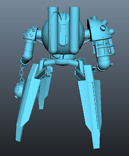
This is how I started the model. I made half of it by starting with a ten sided cylinder and extruded the edges to create the rest.
I then used the mirror geometry tool to "mirror" the half to make it whole.
A closer look.
I finally added a turbo smooth to it to finish it off. It still needs work but this is it so far and for a first attempt i'm really happy with it. I haven't put a head on it because I don't want to.
Drawings and 3D I do...
Thursday, 19 July 2012
Tuesday, 26 June 2012
Hey......Listen!!!
A new image i'm working on. It's Link from the Legend of Zelda series (incase you didn't know). There's going to be something in the background but I havn't decided yet. It's a toss up between Ganondorf or Hyrule castle or something else I dunno.
Friday, 8 June 2012
Finished robot (Dunno why its blue)
The finished thing. I have no idea why it's gone blue, something happened when i was experimenting with it and then it just turned blue so yeah. I changed the legs like I said and i'm really happy with how it now looks.
New robot
Wednesday, 16 May 2012
SPERM EGG!!!!
The finished Sperm Egg, Surreal pic. I like how the planet has turned out at the bottom and how the lighting looks on the image. I'm still not too sure on how the hand looks but I still like it even if it is the weirdest picture I've done and have no idea where the thought for it came from.
Jars
I'm actually quite happy with this image. It looks alright compared to others that I have done. The tutorial was pretty good, he had some useful information. I know it's not spot on to Daarken's image, but I think it looks pretty good otherwise. I'm still getting used to the chalk brushes but other than that, I think this image turned out well.
Apple extra
Messed around with it to make it a bit better. I made the apple shorter and changed the light glare a bit on the centre. It's still pretty sketchy but I definatly prefer this one to the last apple (below).
Subscribe to:
Comments (Atom)


